Explore the World of Music with Tonic.
An onboarding flow to encourage engagement and effectively connect users through music.
The onboarding flow is the user's first interaction with the music app Tonic. It offers a way to receive necessary information from the user to personalize their profile, while also introducing the user to a new, unfamiliar application.
Through my design of the onboarding flow, I sought to simplify and tailor the experience to be efficient and informational, allowing users to learn more about Tonic and be excited to join the community.
I led this onboarding flow project for the team at GLOW Design, conducting user research and designing the mobile onboarding mockups.
Problem
As a new app, Tonic needed a way to introduce its purpose and features concisely while also receiving new user's information efficiently.
Solution
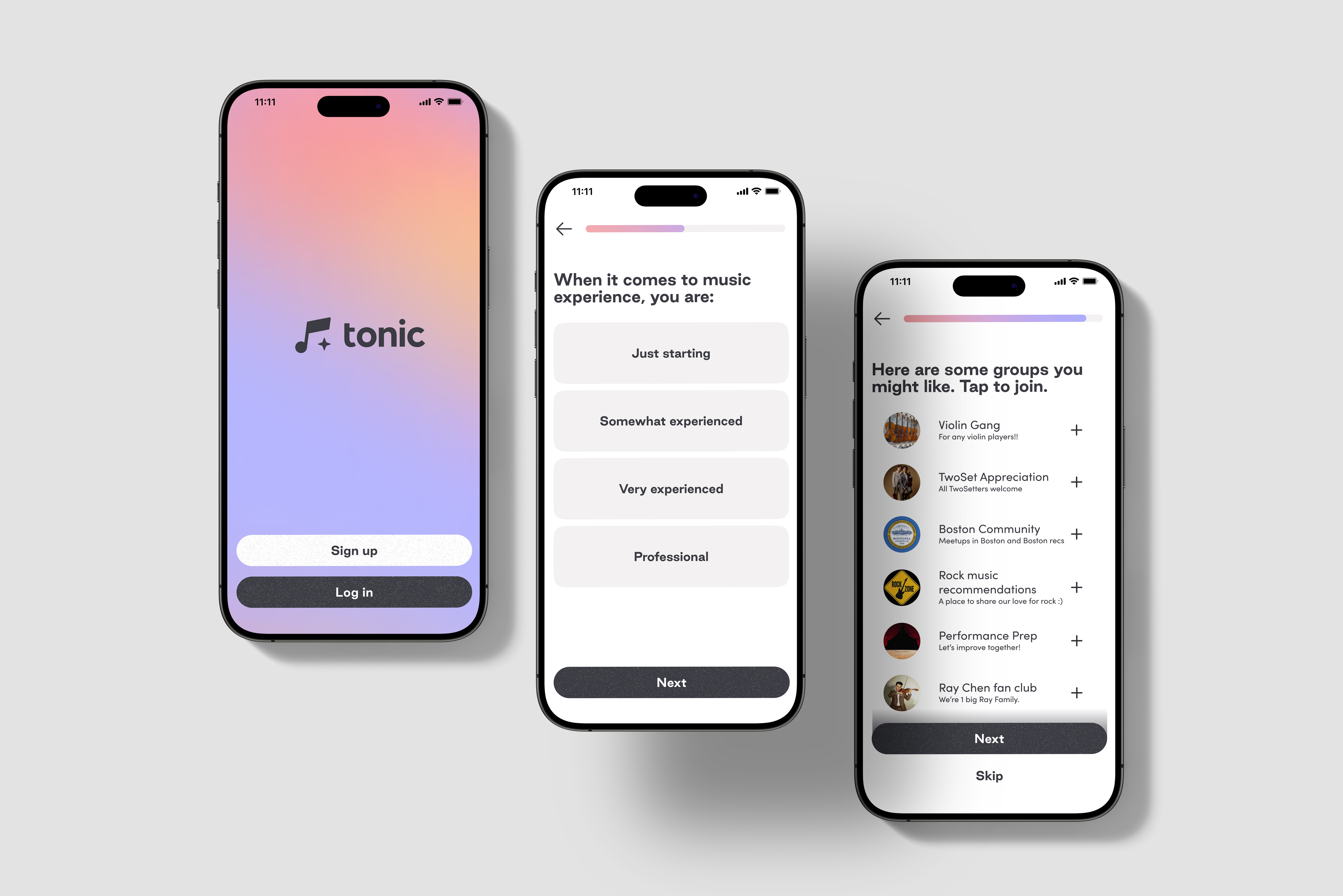
I designed an onboarding flow that effectively summarized Tonic's mission, showcasing features as the user set up their profile.
Defining the Scope
Tonic lacked an introduction to the app and required a way to have users input their information. Since onboarding would be the first interaction that the user would have, it was crucial to not tire out the user with excessive information and overwhelming designs.
I considered a few questions with this in mind:
- How could I balance having a detailed introduction with efficiency and simplicity?
- What features were important to highlight?
- What was the logic behind creating and organizing onboarding questions?
Considerations
What was essential to consider as I entered this project?
Consistency with branding
Designs had been made previously for the app's central functionalities and community features. It was important to maintain the personality and branding of past designs.
Improving user retention
Users found it bothersome to go through lengthy onboarding, resulting in losses in potential new users.
Standards for onboarding
Like many other mobile apps, Tonic needed certain information from onboarding in order to customize user profiles and verify their identity.
Key Objectives
After identifying the problem and considering various needs for this project, I defined two key objectives for Tonic's onboarding flow.
01
Transitioning into the experience
Gently introduce the user to the larger experiences and features within Tonic, maintaining the same feel and experience.
02
Collect user information efficiently
Develop the onboarding flow to be direct and simple, allowing the user to complete onboarding easily.
By analyzing Tonic's target audience, I centered user needs and behaviors to inform my design approach. I conducted in-depth audits of other apps' onboarding flows, determining the typical user experience and highlighting important features to include. Through my comprehensive research and examination of data, I narrowed my focus and gained key insights for the onboarding design.
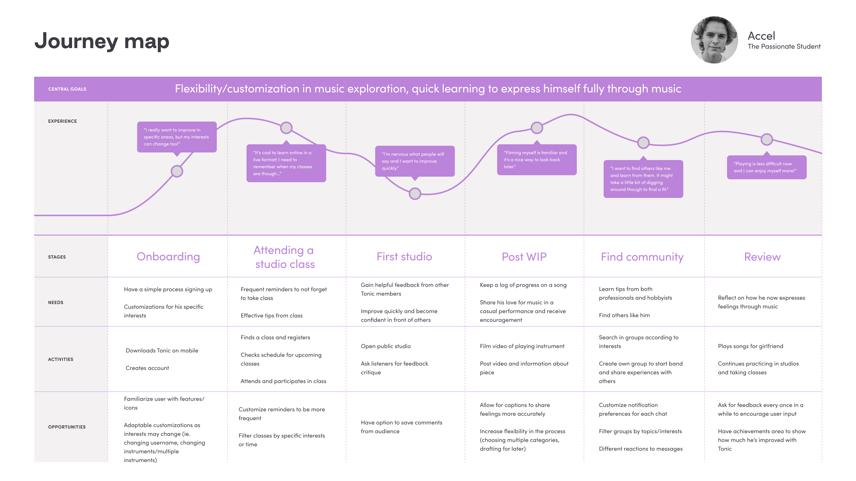
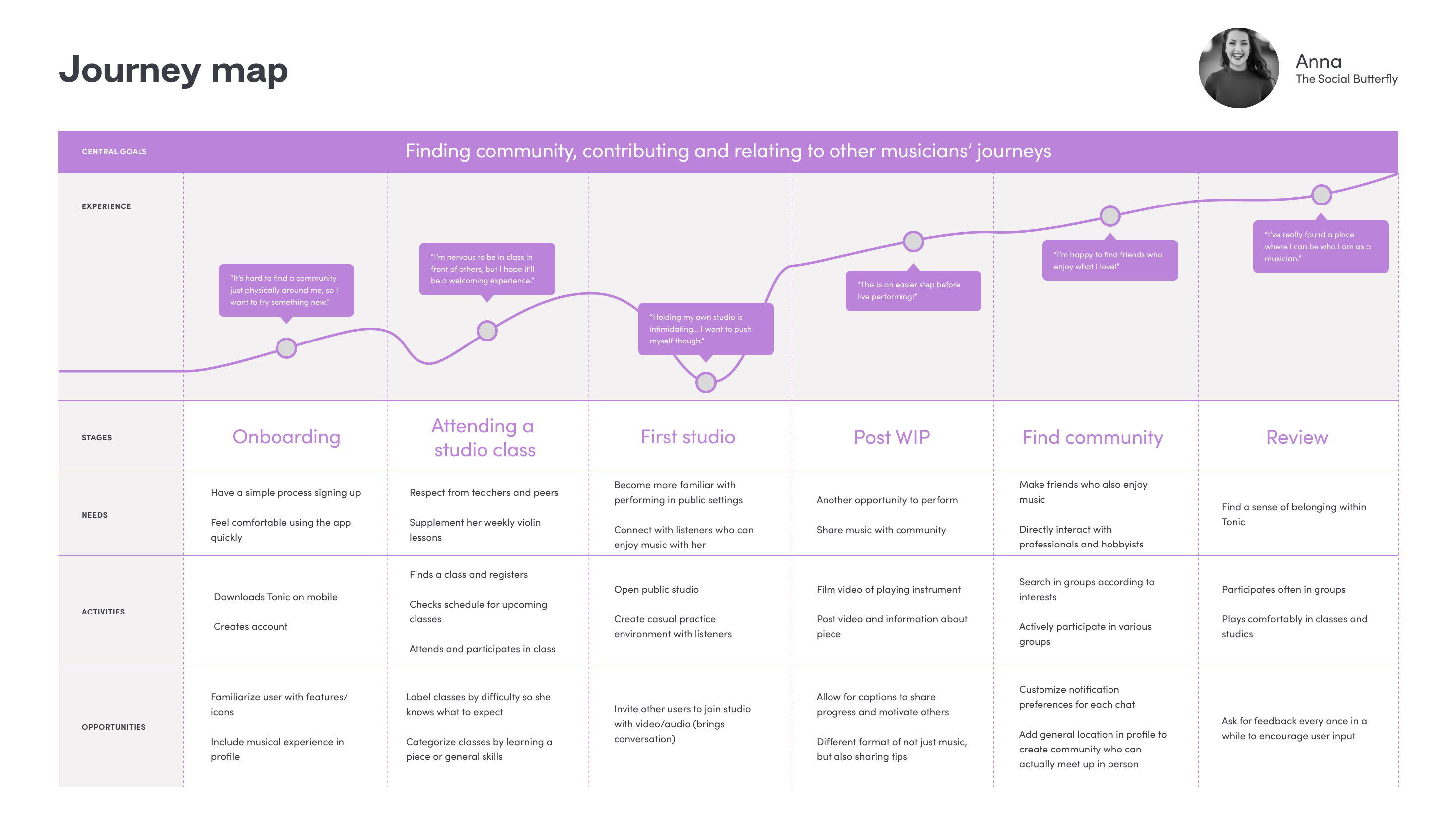
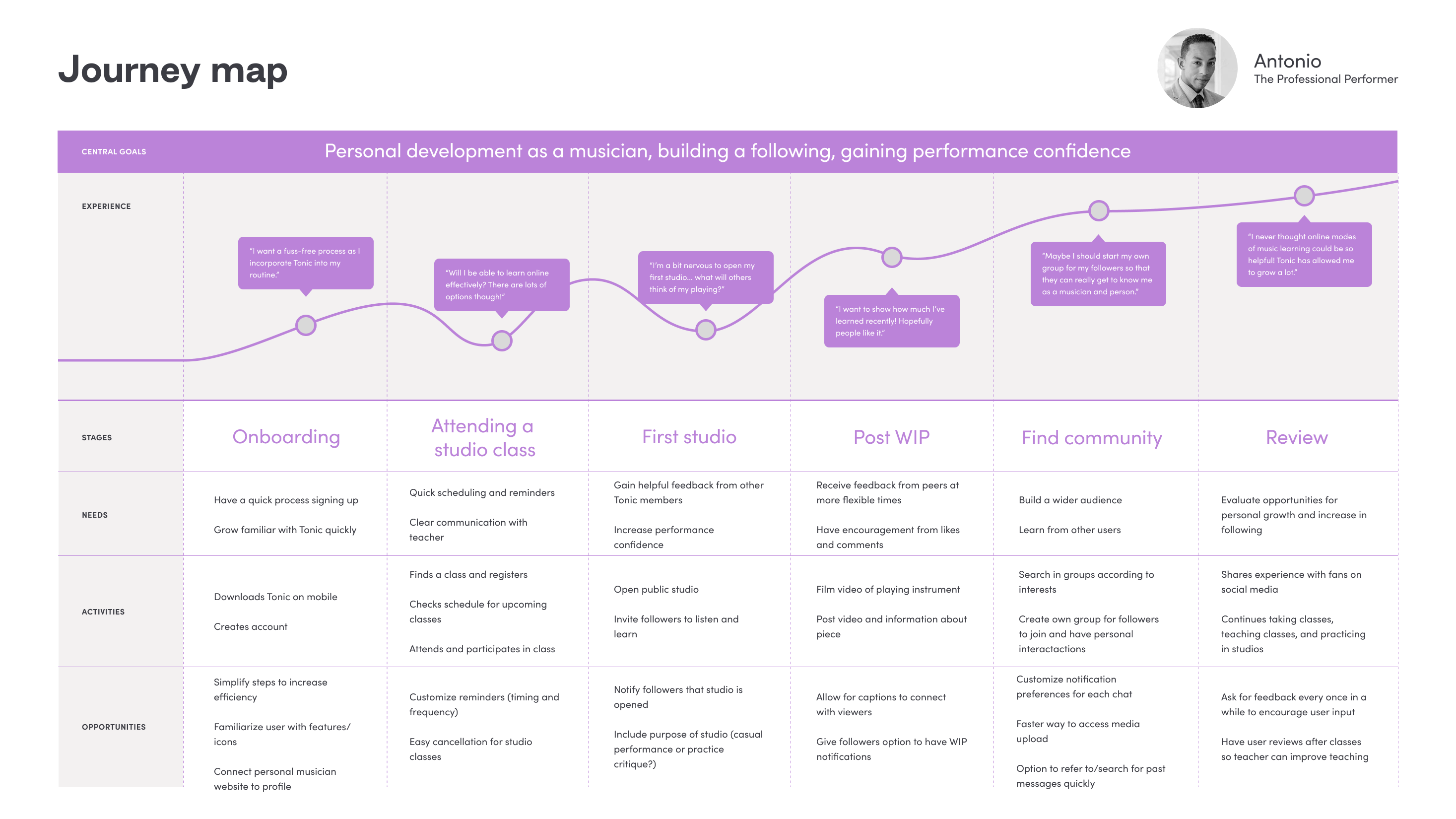
Investigating Tonic's Users: Personas
I dived into exploring Tonic's users, understanding the diverse community who would use and interact with the onboarding flow.
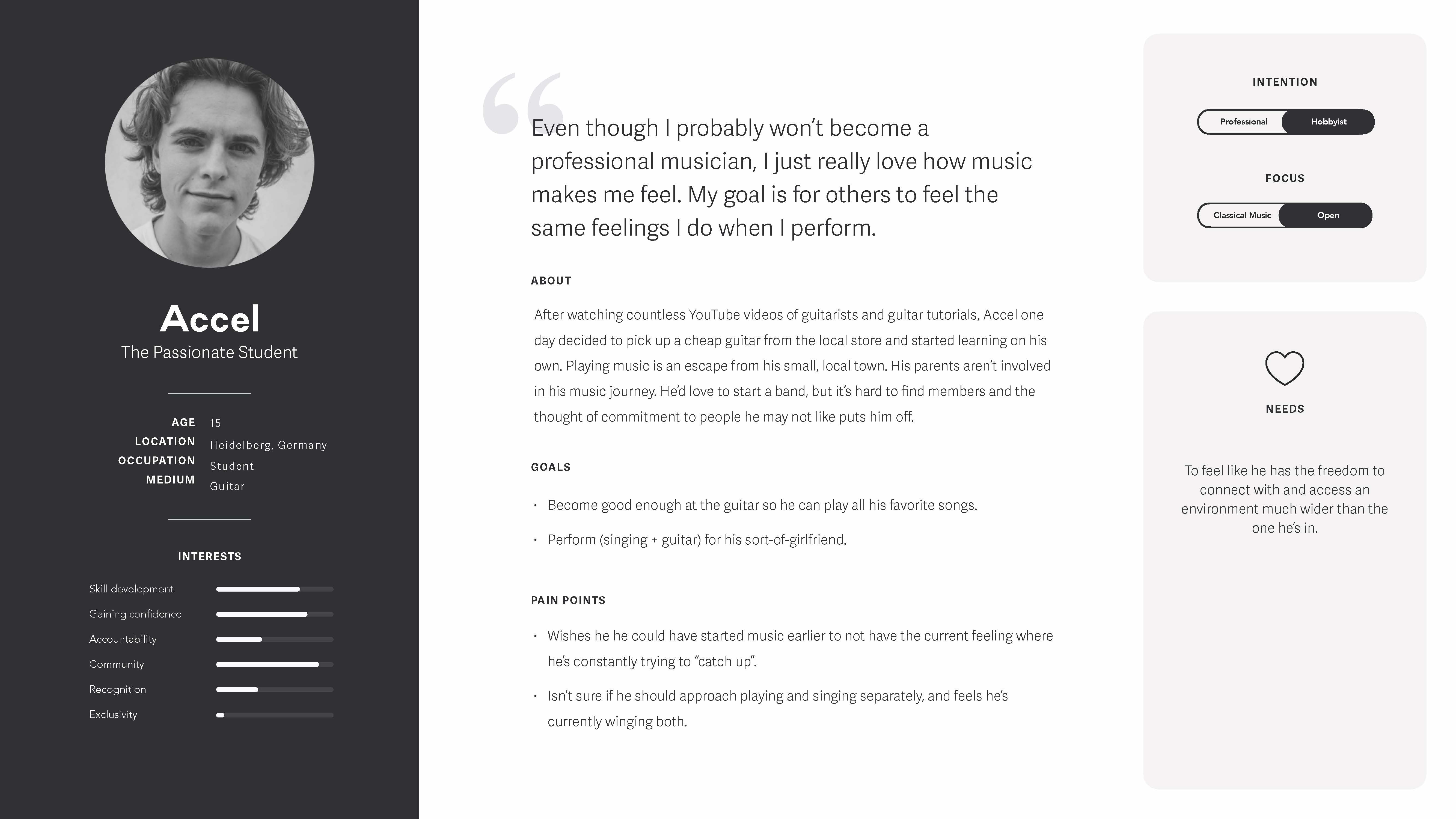
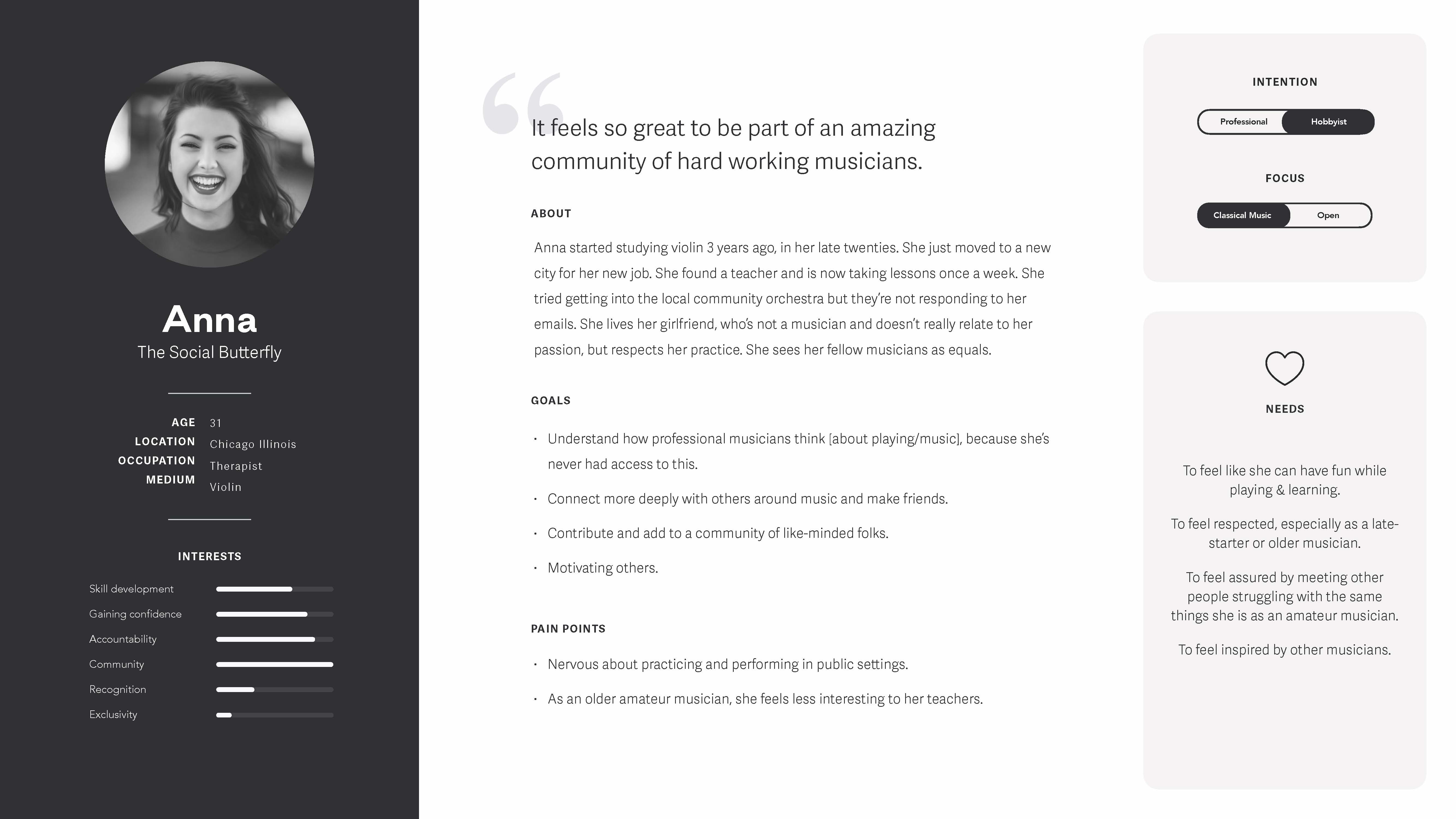
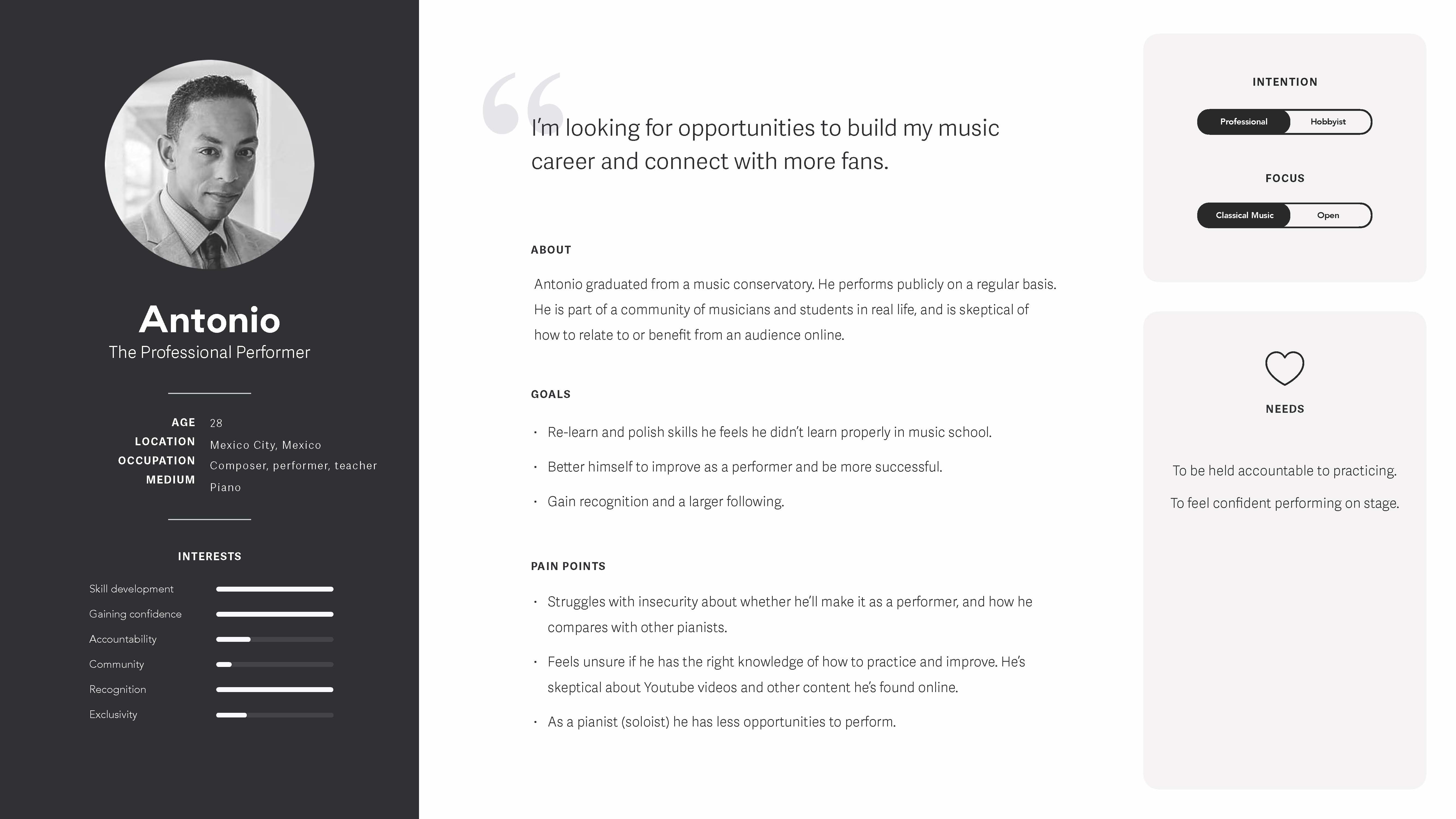
“It's exciting to find others to connect with and feel less alone when I'm practicing.”
From the personas, I created journey maps to highlight user needs and behaviors to guide the framework of Tonic's design.
Identifying Universal Onboarding Features
Through my audit of other apps' onboarding experiences, I identified typical patterns and the logic flow for their designs. By comparing these experiences, I recognized commonalities that would be beneficial to include in my own onboarding design, allowing the user to be quickly familiarized with the experience.
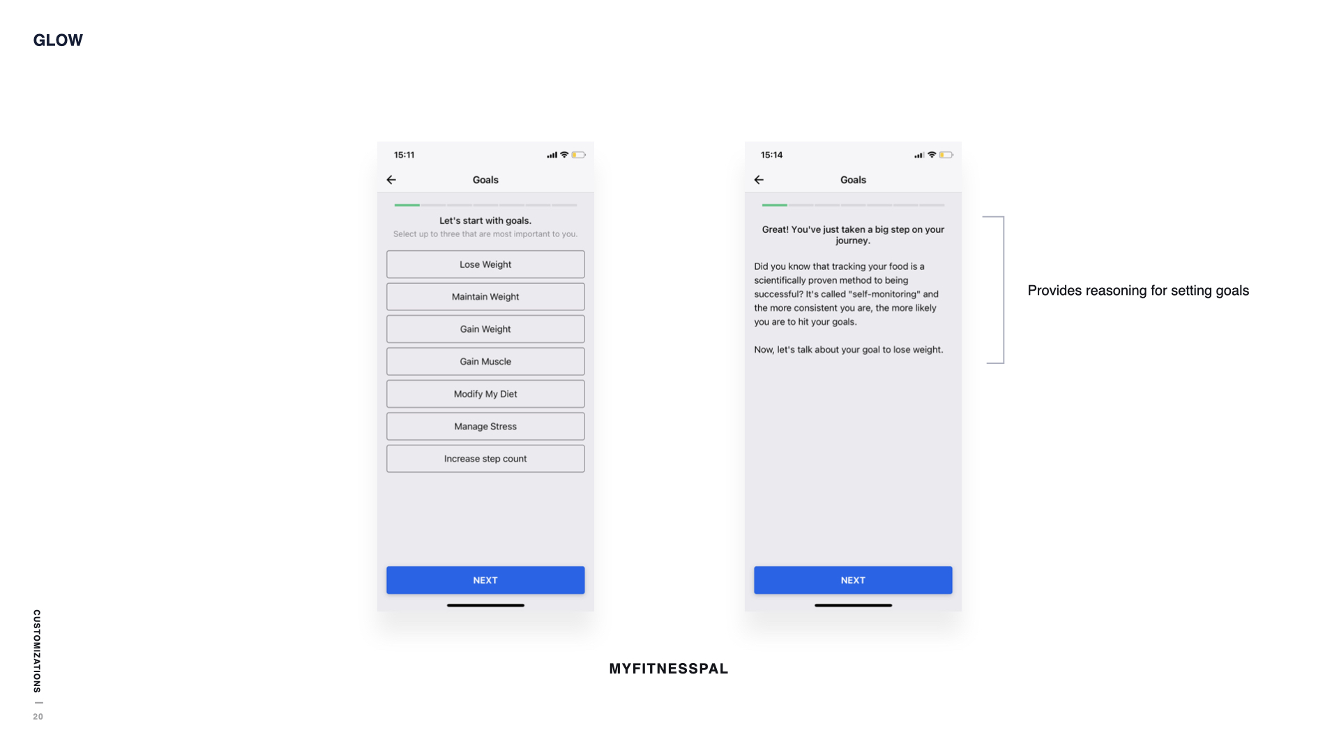
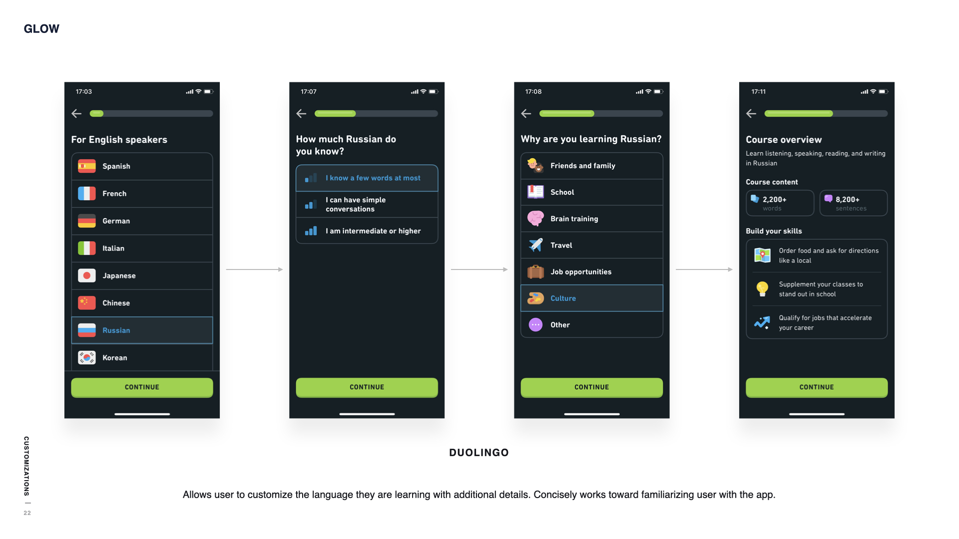
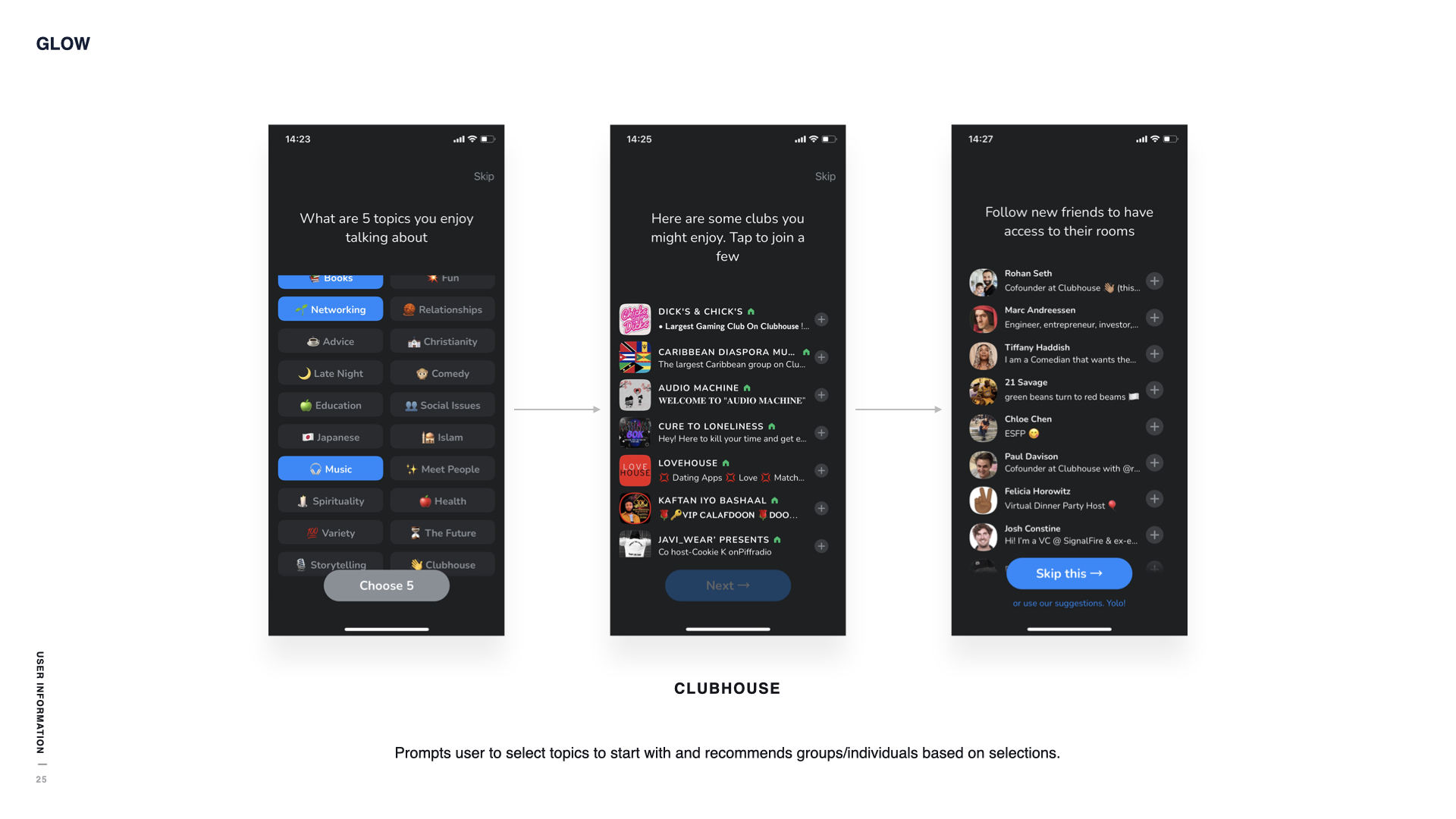
Key Insights
A few features were highlighted through my research of other onboarding flows:
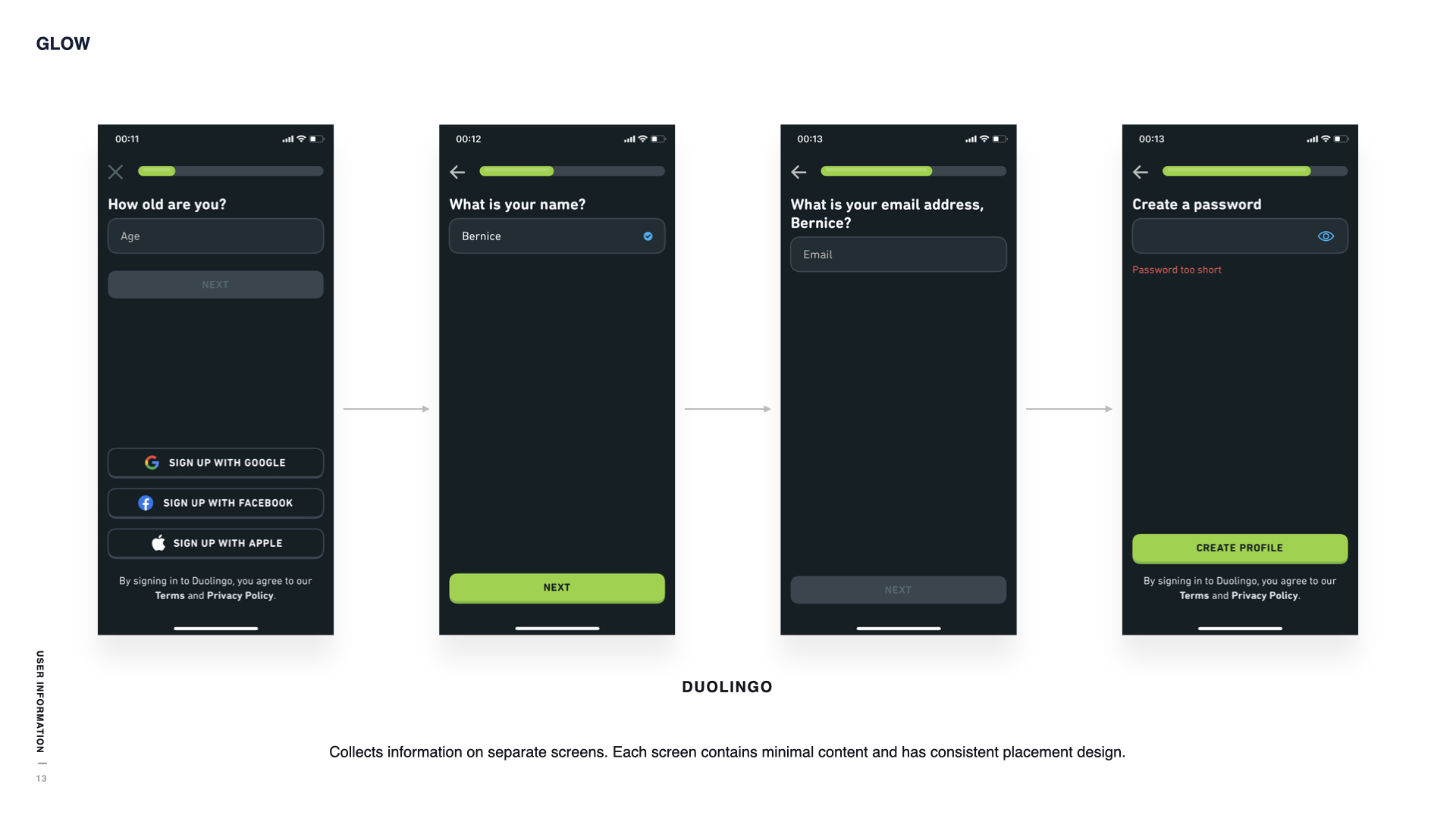
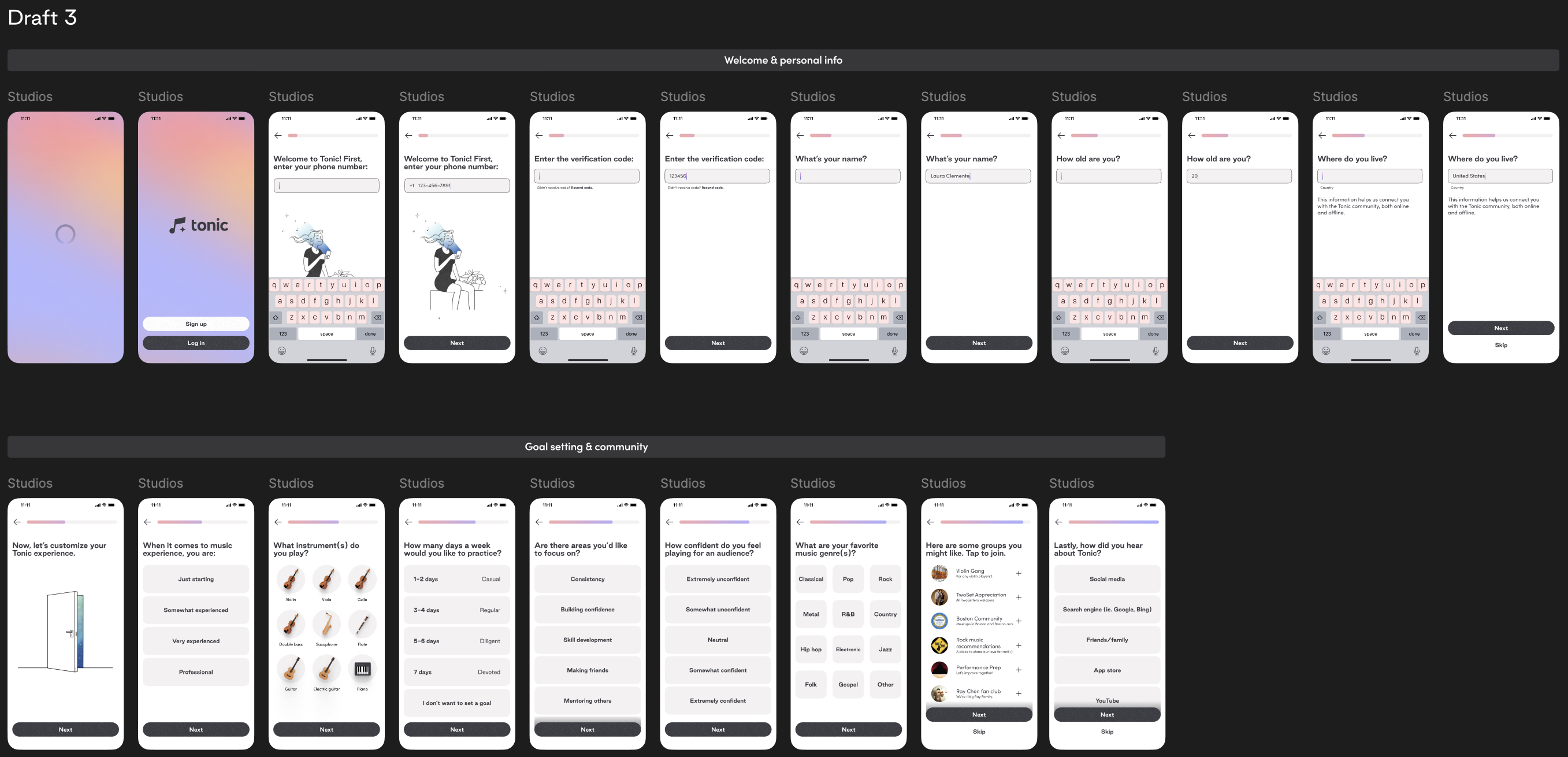
- Top to bottom layouts (question at top, next button at bottom) were commonly used.
- Including a progress bar helped to approximate completion time for users.
- Back and skip buttons were useful for the user to more flexibly navigate onboarding.
Prototyping
After mapping out the required information we needed from users and summarizing my research, I explored several iterations of the onboarding flow, adjusting based on user feedback during usability tests.
I first centered on the basic question flow, creating the base layout for the screens to be consistent throughout onboarding.
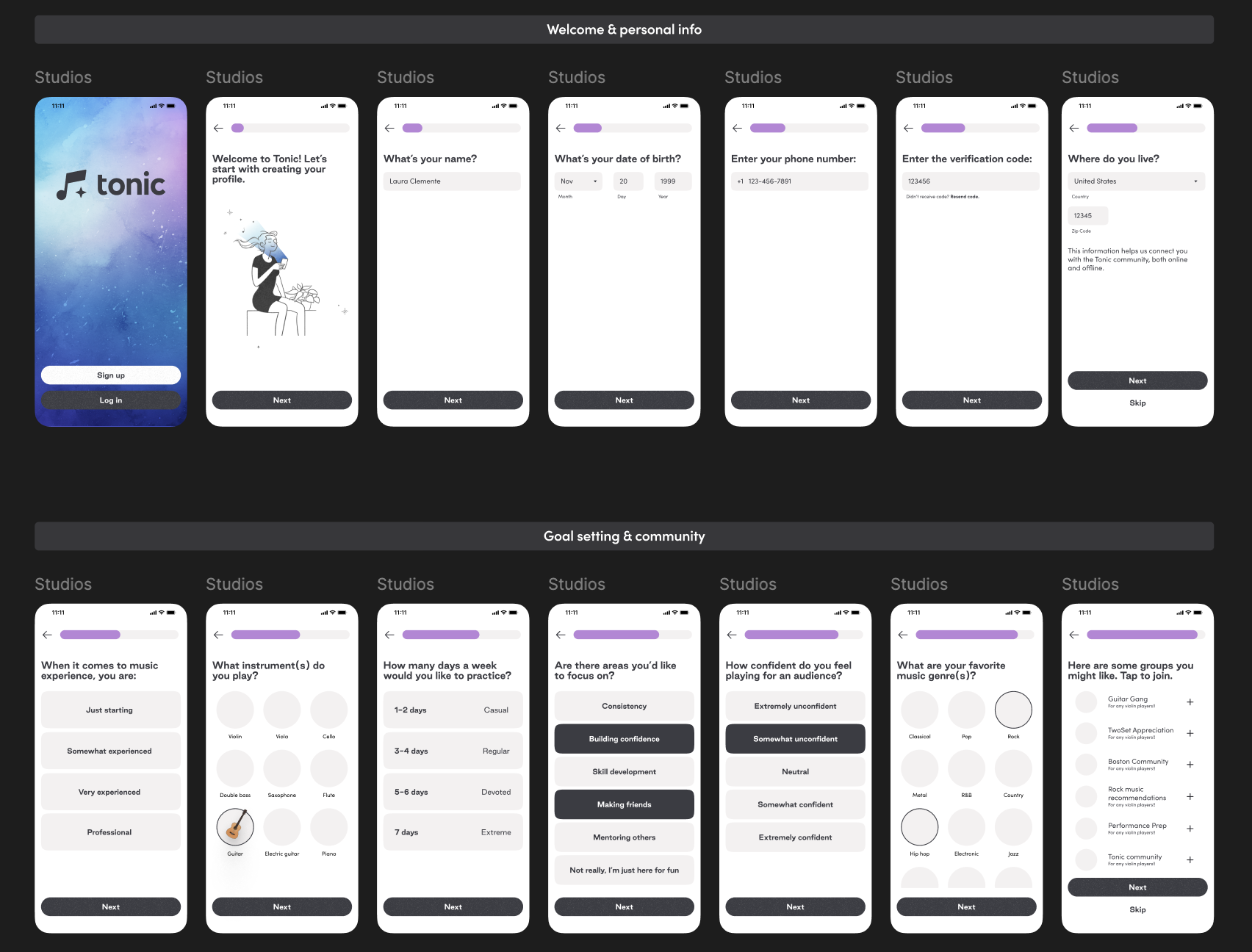
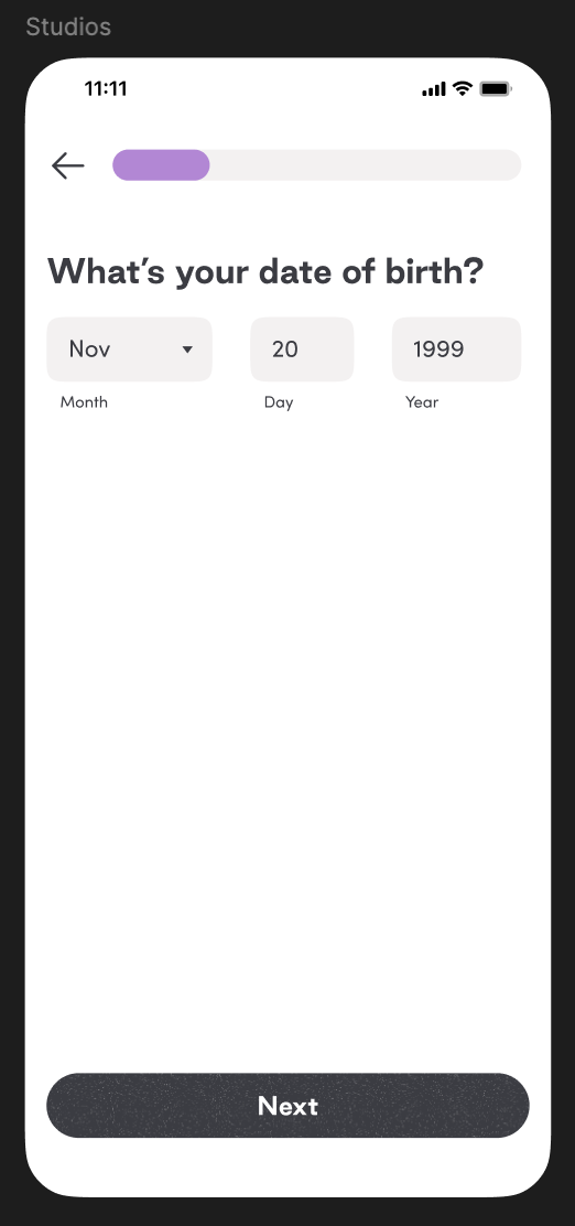
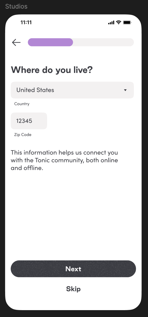
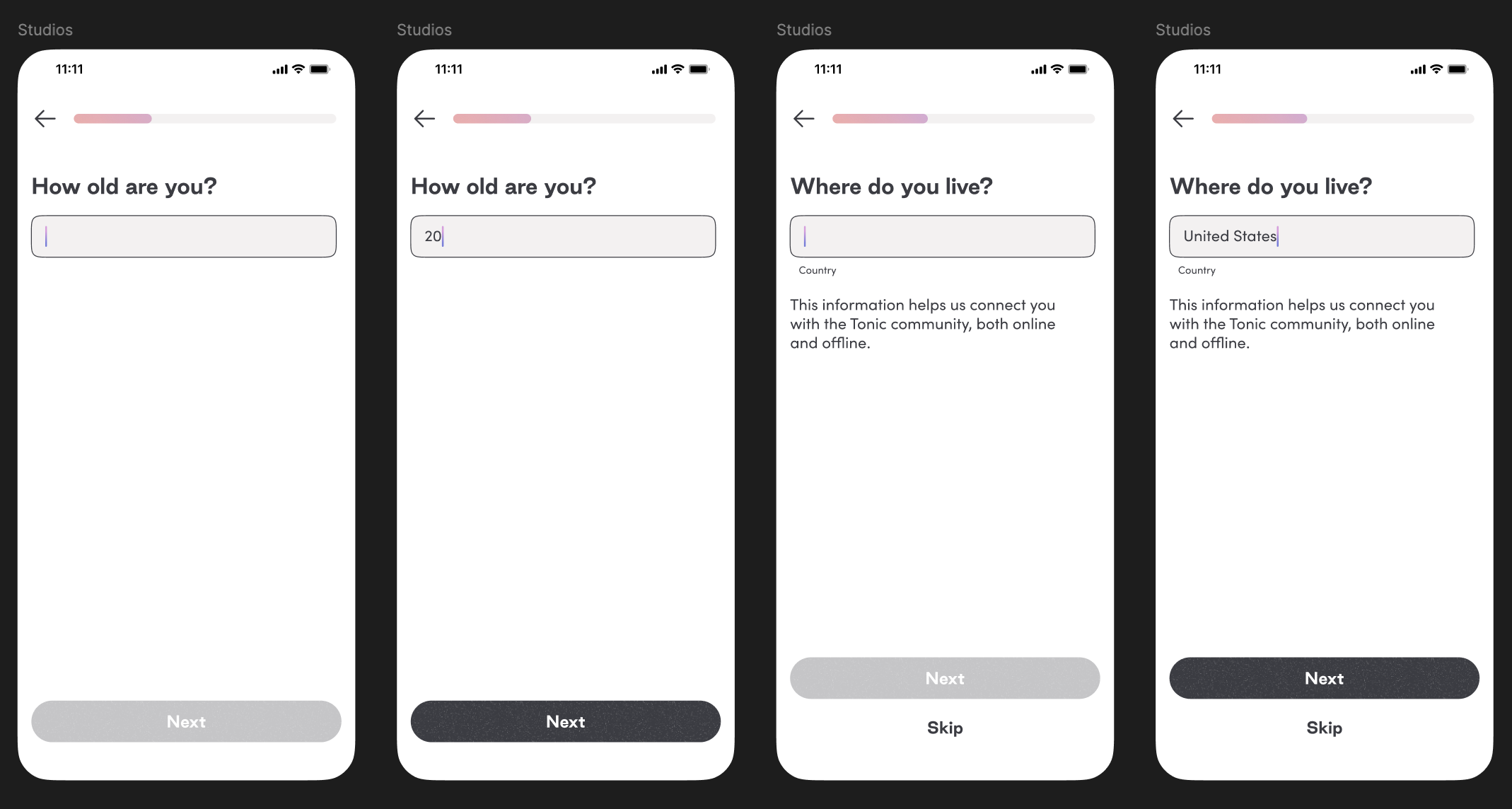
Visual branding was refined, matching the updated design system. The onboarding screens were simplified to reduce time needed to complete onboarding, such as asking for age rather than date of birth.
Comparison of Iteration 1 with Iteration 2
Before
After
A comfortable onboarding flow for Tonic, directing users to rapidly customize their profiles and familiarize themselves as they enter into the world of Tonic.
What Did I Learn?
This project gave me the opportunity to tackle a crucial interaction in the user experience. I had to consider how the onboarding design would act as the first impression for Tonic, essentially summarizing the app in a few screens. A major challenge was deciding what was necessary, skimming down the onboarding to be as efficient as possible while still retaining important information. It was important to strike a balance between too much and too little information.
Working in a design agency also illustrated to me the importance of presenting progress and explaining the logic behind decisions to clients and stakeholders. It helped to break down the larger project for other teams to understand and ease the collaboration process.
Next project
TIFIN Website Redesign