Streamlining Finance with TIFIN.
A suite of AI fintech products to support the diverse needs of clients. TIFIN provides more efficient approaches to encourage financial growth and intelligent wealth management.
With its large suite of products, TIFIN needed to find a way to unify its identity while showcasing its diverse sub-brands. TIFIN's website needed to centralize information about the main TIFIN brand while directing clients to its product offerings, providing a clearer connection between every TIFIN product.
The redesign of TIFIN's website aligned the visual identities of the sub-brands under the TIFIN family identity, refining the vision of the company and providing a logical flow for clients interested in exploring TIFIN.
As the product designer for TIFIN's website redesign, I collaborated with 1 marketing designer to establish a core branding identity for the website. Through a simplified design system and stronger connections in branding, I created high-fidelity prototypes and independently built web pages to ship the live website.
Problem
TIFIN's diverse products had too many individual identities, losing the connections within the company and negatively impacting the larger TIFIN brand.
Solution
By redesigning the website and creating a more cohesive identity for TIFIN products under the main TIFIN website, I strengthened the TIFIN brand and improved information accessibility, growing user engagement across TIFIN.
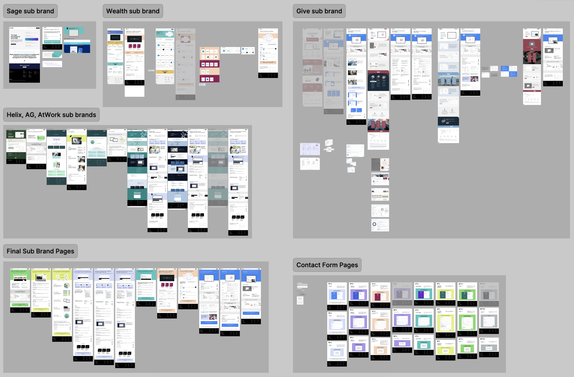
TIFIN's sub-brands had splintered into disconnected identities — hurting the brand as a whole.
TIFIN had separated its sub-brands into individual websites with branding that was totally different from the other sub-brands. This created a lack of consistency and cohesion, decreasing opportunities for clients to find other TIFIN products easily for their diverse needs. The disconnect across TIFIN's suite of products caused TIFIN's overall image to be viewed as not finessed and unprofessional, which clashed strongly with TIFIN's users. TIFIN needed to grow together as a brand, highlighting TIFIN rather than being known for a singular product.
Issues with old sub-brand websites
- Inconsistent logo styles
- Large variance in visual graphics and imagery choices
- Lack of uniformity in layouts and website organization
- Color schemes created without consideration for other sub-brands
- No core branding represented in sub-brands
A streamlined browsing experience to explore TIFIN products — all under one unified brand.
- Showcases uniform visuals that align closer to TIFIN's larger vision, improving consistency and clarity around products and services with potential clients.
- Directs users through exploring TIFIN with a more logical flow through a reimagined navigation system.
Product Landing Pages
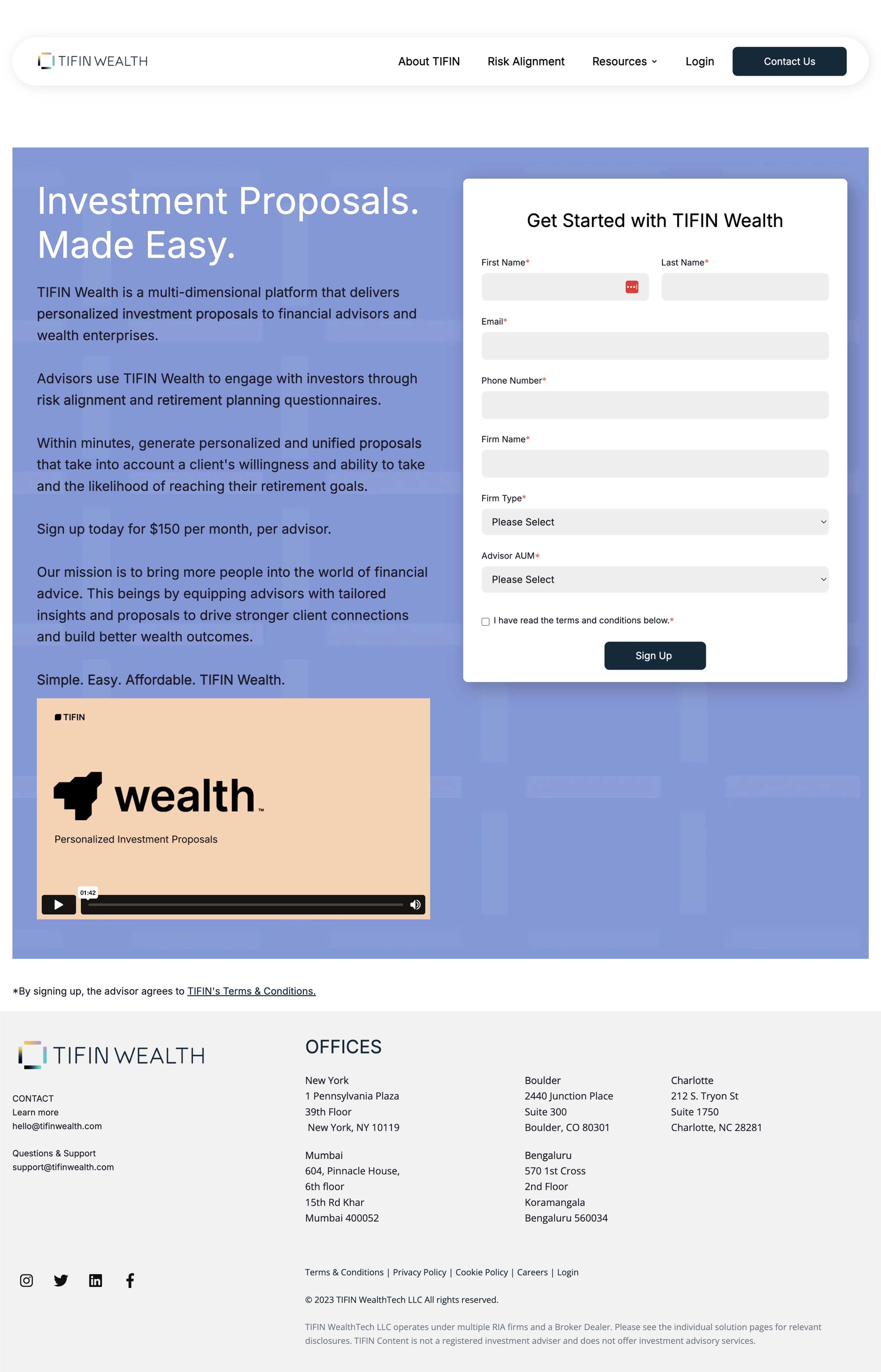
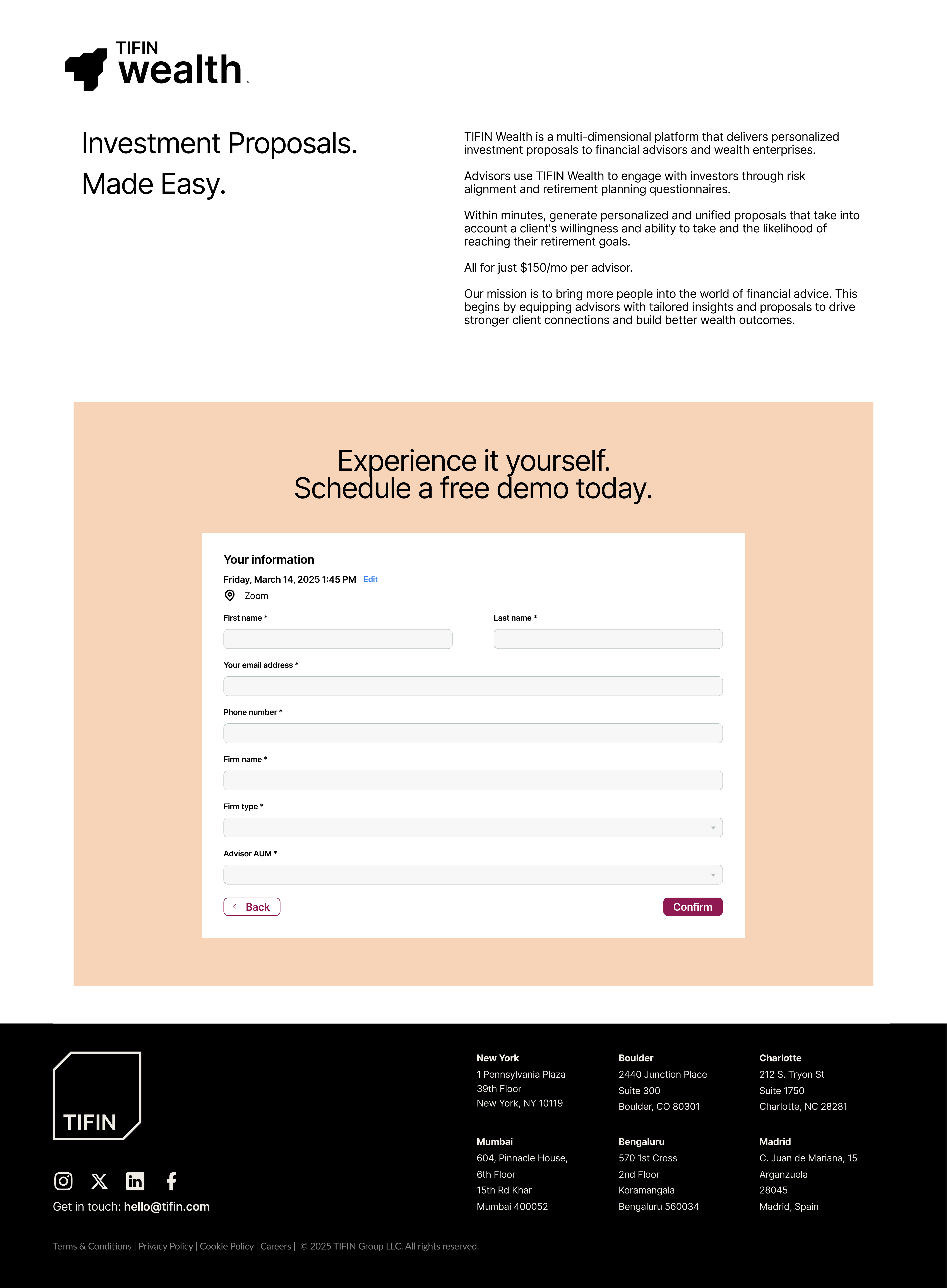
Wealth Management
Before
After
Helix
Before
After
Product Info Pages
Give
Before
After
Wealth Info
Before
After
Contact Form Pages
At Work
Before
After
Wealth Contact
Before
After
Navigation Bar Design
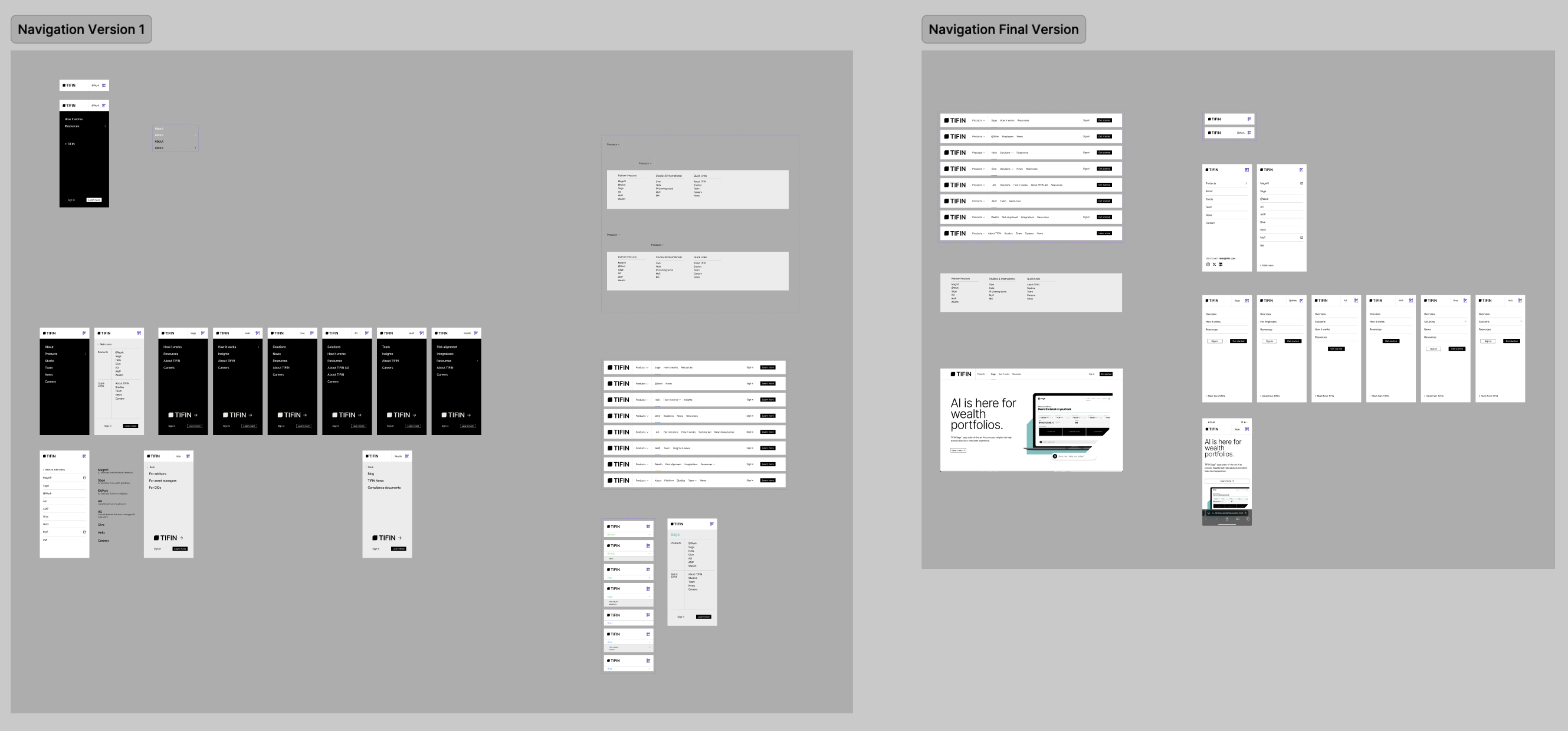
Creating a comprehensive website means always knowing how a user moves through it — clarity of flow matters more than visual polish.
Creating the new website for TIFIN was a large project that had to simultaneously showcase diversity in its products as well as strong unification in the overall brand. It was a fast-paced project from design to developing the website, pushing me to quickly pivot and adapt based on the needs of my team. Because there were so many pages and products to support, I found it crucial to have a clear perspective on how a user would move through the website, finding information based on their needs. By utilizing clear patterns and layouts across product pages, I was able to build a comprehensive, organized website that did not feel overwhelming.
TIFIN's many sub-brands also meant that there were many separate teams to work with and stakeholders who provided input on my design work. This was a great opportunity to dig deep to discover commonalities across many ideas, ultimately creating a result that represented what TIFIN is as a larger organization.
Next project
Tonic Onboarding